2024
時叁映画 TRITIME Filming Studio
Brand Identity時叁映画 TRITIME Filming Studio
Documenting the Time of Moments' Existence.
時叁是一間位於台中的動、靜態攝影工作室,我們探究生活當下的本質,紀錄光線在空間映照出來的美好,使時間成為能實際感受到的情緒起伏,讓未來翻閱回憶的時刻,填滿過去回憶的空隙,成為現在溫暖的模樣。
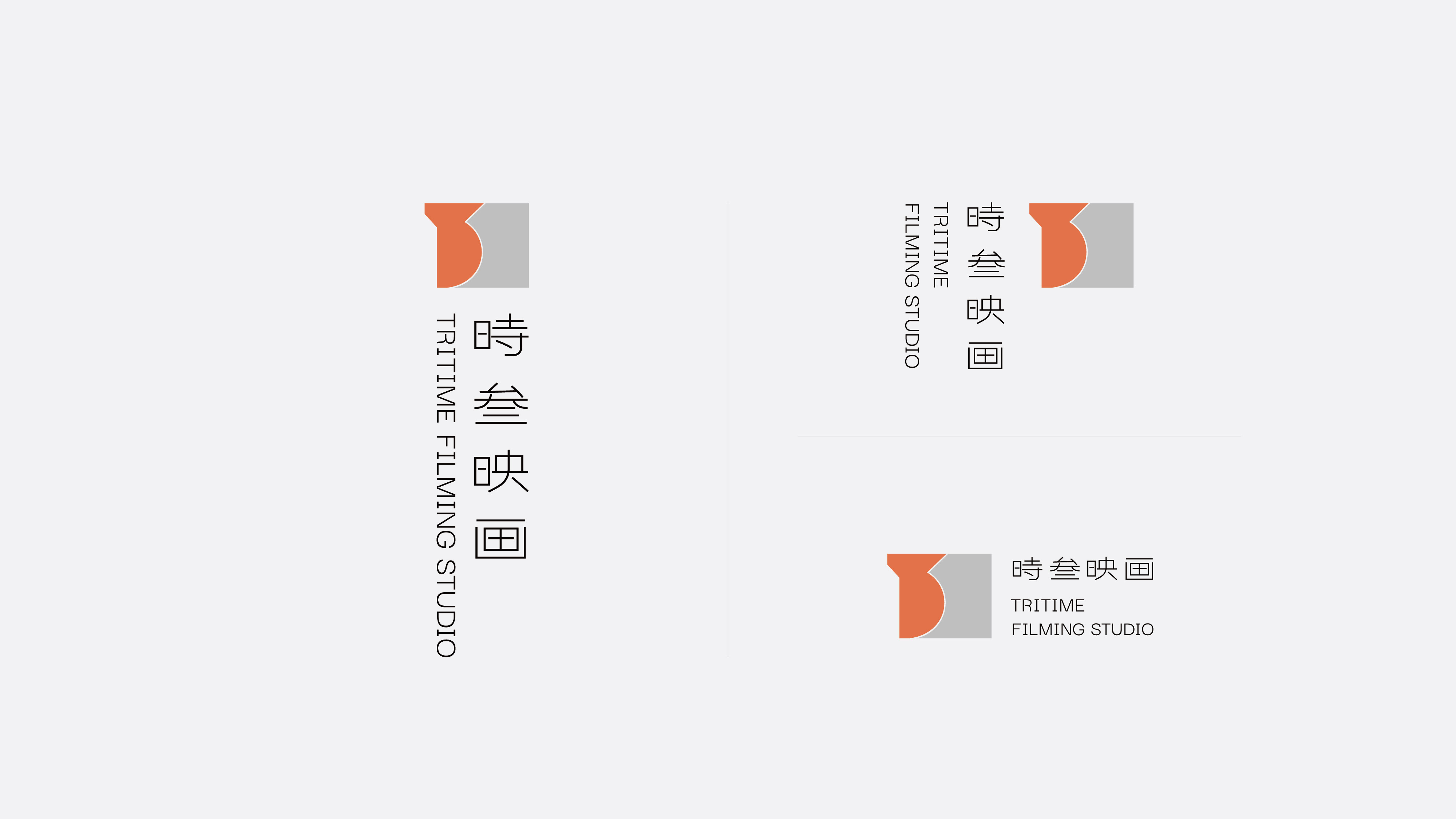
識別標誌的發想靈感,來自與中文發音相同的數字「13」,將數字直觀地融入識別標誌中,為品牌名稱與標誌賦予了更深層的象徵連結。標誌中「3」的形狀曲線,不僅是品牌名的延伸,外輪廓也如同一隻手輕握相機的姿勢,捕捉瞬間記憶;俐落的轉折表達對攝影的致敬,象徵光線穿過空間、反射變化的過程,影像隨光影變幻出不同的層次與深度。
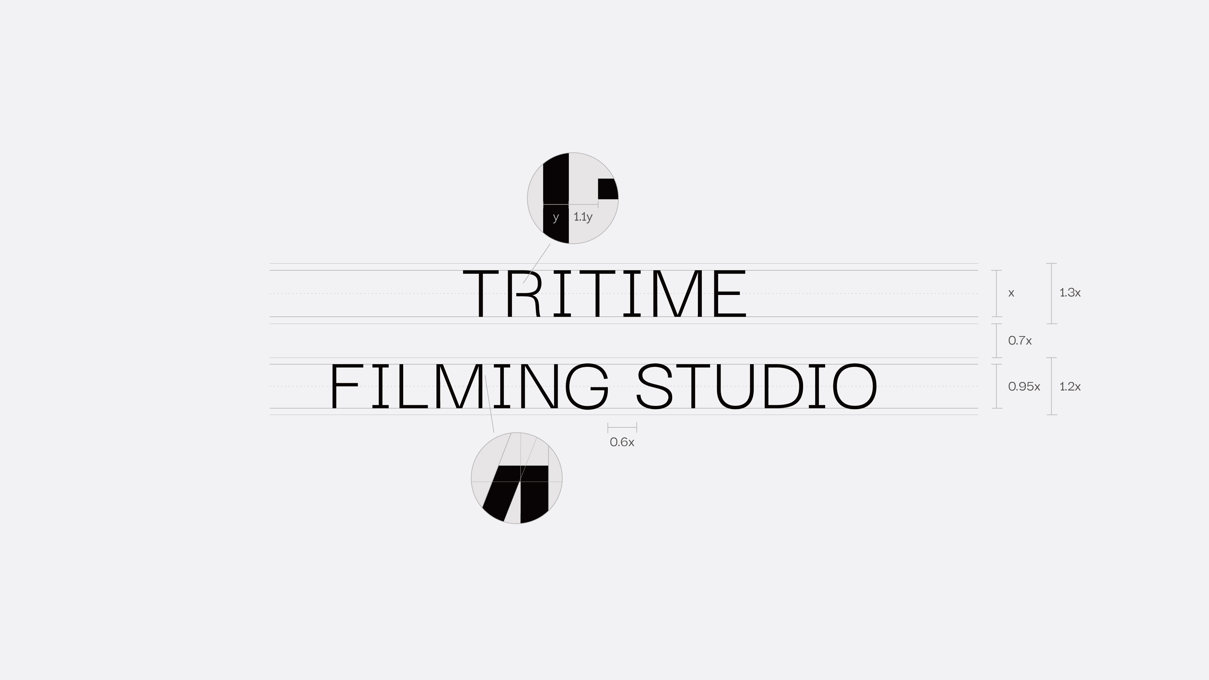
在識別系統的編排中,我們運用了相機九宮格的格線作為版面規劃的基礎,這種布局方式不僅展現出設計的精準與理性,更能在視覺上傳達一種冷靜、平衡的氛圍,讓標誌與文字設計間保持一致而沈穩的形象。從標誌到排版的每一筆劃、每一格分割,都在強調攝影的秩序美學,為觀者營造出一種感性與理性並存的視覺語言。
-
Tritime is a dynamic and static photography studio located in Taichung. We delve into the essence of present life, capturing the beauty of light as it reflects in space. We make time tangible, allowing for the actual experience of emotional fluctuations, so that in moments when the future recalls memories, they fill the gaps of the past, becoming the warm semblance of the present.
The inspiration for the brand logo comes from the number "13," which shares the same pronunciation in Chinese. This number is intuitively integrated into the logo, creating a deeper symbolic connection between the brand name and its visual identity. The curved shape of the "3" in the logo not only extends from the brand name but also resembles the gesture of a hand gently holding a camera, capturing fleeting moments and memories. Its clean, dynamic lines pay homage to the art of photography, symbolizing the passage and reflection of light through space, where images take on different layers and depths as light transforms them.
For the visual system, we utilized the grid structure of the camera’s rule-of-thirds as the foundation for layout planning. This grid not only conveys precision and rationality in design but also instills a sense of calm and balance, maintaining a consistent and steady visual impression across logo and typography. From each line in the logo to every segment of the layout, the design emphasizes the order and aesthetics of photography, creating a visual language that blends sensitivity and rationality for the viewer.


